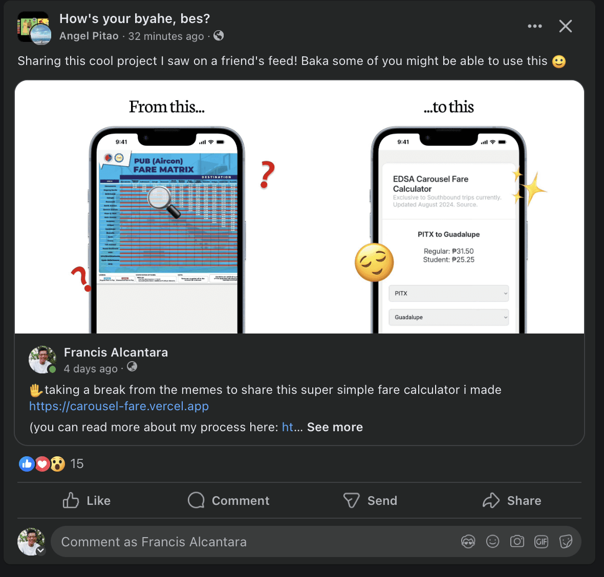
EDSA Carousel Fare Calculator
A simpler way to calculate EDSA Carousel trip fares on mobile.
Timeline
2 weeks
Responsibilities
UI Design
UX Design

Try it yourself!
Visit carousel-fare.vercel.app to try it out.

Sept. 20 update
I've posted this on three social media platforms: Facebook, LinkedIn, and Reddit (specifically on /r/HowToGetTherePH. The responses have been really insightful and a lot more than what I expected.
This is the first time I've created something that people can actually use and it's been cool to see the responses (even if they're primarily vanity metrics, I know, but still very motivating!).
On LinkedIn,
My post received a fair amount of impressions and engagements, mainly from my connections.

On /r/HowToGetTherePH
My post reached a 100% upvote rate and almost 100 shares.

On Facebook

The post got over 100 reactions and shares. The absolute craziest thing that began to happen was that I started getting notifications from people I wasn't even friends with sharing and engaging with my post. Very cool!
It was even shared on a Facebook group I'm part of. That was a weird experience: seeing someone talk about your work while you're there. I'm grateful it's a positive one.
I'd like to think that these are signals from the community to pursue this idea further. It started out as a simple project; now it seems like it could more than that if I figure out how to maintain and improve it right.
Making the EDSA Carousel Fare Calculator
Fare matrices aren’t user-friendly. I discovered that while I was figuring out how much it cost to get to Mall of Asia from Trinoma. On EDSACarousel.com, a fairly legitimate looking URL, this is what greeted me:

It took me way too long to figure out costs. What’s worse is that I was on my phone. It probably took me about a minute. I asked my girlfriend if she could find what I was looking for, and she encountered the same problem: it was too confusing.
The struggle easily fueled my motivation to attempt a better solution.
Establishing Functionality
I had a simple idea of what I wanted to happen, especially since it was similar to my first case study and explorations on redesigning the P2P website. But I wanted to ensure that it was feasible. That is: codeable, and understandable enough for a person like me whose chief front-end achievement is a certificate from freecodecamp.org.
Since I only knew a limited amount of HTML and CSS, and absolutely no Java, I sought the guidance of the world’s most accessible coder: ChatGPT.
ChatGPT: My Front-end Partner
It took me a couple of days to figure out the right prompt to get ChatGPT to do what I wanted. Somewhere in its response, the code would break or make sense; when I asked it to fix it, it would often spit out different codes altogether. I realized that I was asking too much of it.
The basic structure ChatGPT eventually gave me. It took a lot of trial and error.
For example, I wanted it to code four functions
Buttons where users can choose whether they’re going southbound or northbound
An input field for the origin
An input field for the destination
Buttons for users to select whether they were a regular or student passenger
The complexity of this kind of system meant there were a lot of moving parts. In an effort to ship a minimum viable product, I decided to make the product focus on one route instead and present both fare prices, for regulars and students.
After a lot of trial and error on the prompt, this was the one that made a good result:
I want to create a fare calculator for commuters who want to use the EDSA Carousel Bus. The task flow is simple.
1. The user selects their origin.
2. The user selects their destination
3. They press Calculate Fare
4. Then, on screen, they’ll see the fare for the trip: Both for Regular and Student prices.
Now here are some caveats.
- I need the backend java to be easy to update since fares and stations change often
- The destination options will depend on the origin the user selects. For example, let’s say the stations go from PITX, City of Dreams, DFA, then Roxas Boulevard. If the user selects City of Dreams, I can’t let them select PITX as their destination, because the bus line always goes one way. So I need you to make the Java reflect that
It was like magic. It gave me the basic HTML structure which was this:

It was something to work with. The next step was to make it look modern and friendly for smaller screens.
Improving Aesthetics
There was a lot of back and forth between Figma, ChatGPT, and Visual Studio Code at first. I just needed to know that making the thing was feasible, as basic as it looked. Although ChatGPT gave the CSS, I knew I needed to make some changes to it to make it more user-friendly.
The position of the calculated fare

The first pieces of code that ChatGPT produced had the fares appear near the Calculate Fare button. That didn’t seem like the ideal place for two reasons:
It breaks the rhythm of interactive elements
It wasn’t in an easy to read place; users would be blocking the spot with their thumb
So I designed the UI to make the results appear higher up the screen, more in line with the user's line of sight. It felt more like how calculators display numbers.

The drop downs: Origin or Destination first?


Destination-first design is how Sakay.ph approaches it. But I wanted to verify commuters' thought processes when figuring out how to commute to a certain place. To understand that, I went to reddit.com/r/HowToGetTherePH, a subreddit where people can ask for commuting advice. I quickly saw a pattern: people considered their destinations first. So I designed it accordingly.

The buttons
I originally designed the buttons to match the comforting gray color. After receiving feedback from fellow designers, I changed it to add more contrast.

Asking for design feedback felt like an opportunity for growth.
I sought feedback from my fellow volunteers from Friends of Figma. They were all experienced designers and I wasn’t. I felt really shy about showing what I had been doing. Ultimately, I knew that this would have to be something I'd need to get comfy with.
So, like tossing a flashbang into a room, I asked for feedback and looked away. When I mustered the courage to read their feedback, it turned out to be quite insightful.

The Roads Not Taken
I had a few ideas which seemed interesting that I couldn’t yet execute for the simple reason that I don’t have the expertise to do them.
The bus ticket
The idea to design the web app like a bus ticket came from reading Contagious by Jonah Berger. My thinking was that if the product evoked some kind of emotion—in this case, nostalgia—it would become its own marketing.

I didn’t take this road because it involved a good amount of CSS design I haven’t yet learned how to do.
The swipe location

What if, instead of typing one’s origin, you could easily swipe it instead? Theoretically it sounded cool. But practically, I wouldn’t expect anyone to swipe through more than 10 stations to find the one they’re looking for.
Aside from that stopping me, it was also the fact that I had no idea how to even begin coding this execution.
What I learned
This was a fun little project that taught me how important it was to draft a wireframe and prototype first. If this project were a house, I went straight to mixing the cement and placing the bricks before finalizing the architectural blueprints. The mixed priorities led to inefficiencies that I intend to avoid as I learn more about the product design process.