Making essential information easier to reach
It all started because I got scratched by a rusty nail...
Timeline
2 weeks
Responsibilities
UI design

So this rusty piece of metal lightly scratches my shin
I was walking through my girlfriend's garage to get my bag from the car.
I didn't see it but there was a rusty piece of metal sticking out among a pile of construction materials stashed in the garage. They had handymen fixing their roofs, which made piles of construction materials liable to hang around maliciously.
I was slightly worried because I hadn't had my tetanus shot.
Fortunately, there was a hospital nearby. And they accepted my insurance. But there was a problem: I didn't have my physical card with me.
The app has a virtual card
But you'd have to dig to find it.
That was my first time using the Maxicare app. And the first time I realized a possible UI redesign opportunity.
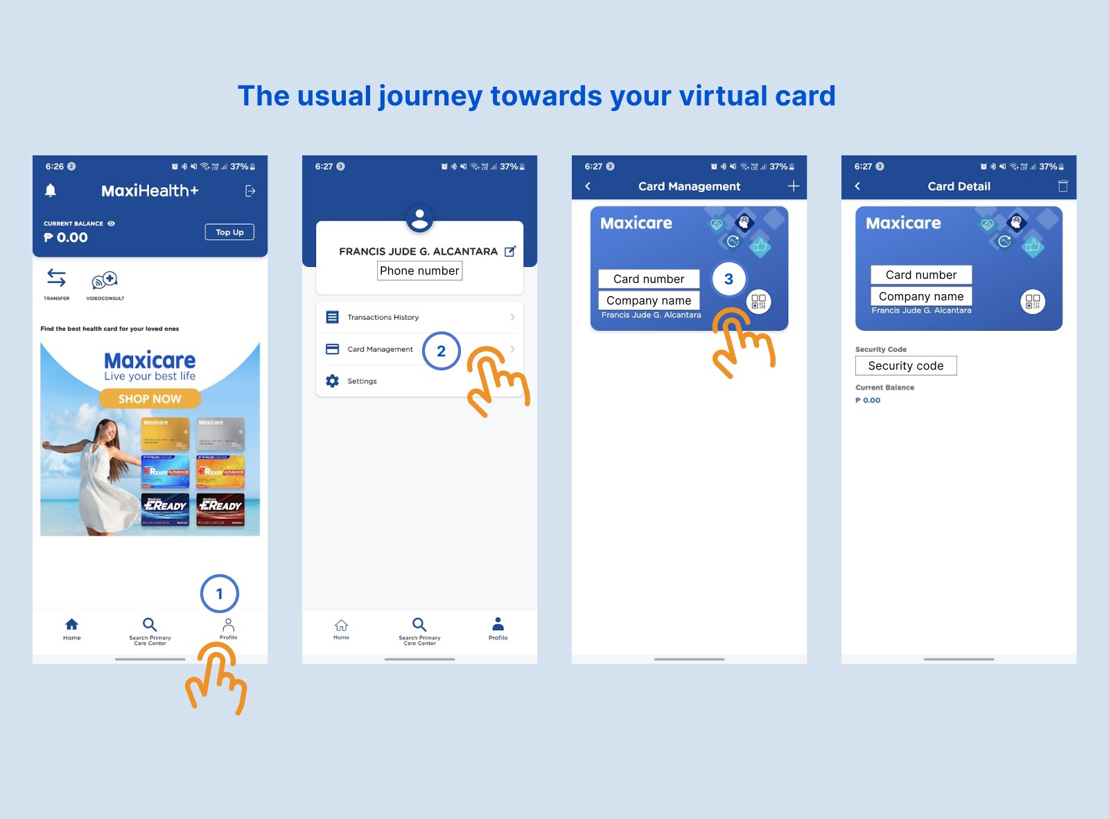
The home screen could be more efficient
Four taps! It takes four taps just to get to the virtual card. If it were physical, it would take 2 actions:
Open my wallet
Pull the card out
That's why I explored how to shorten the path to the card. And for some closure on my nail story: everything turned out fine. Rusty metal shouldn't be a concern for me for the next half-decade.
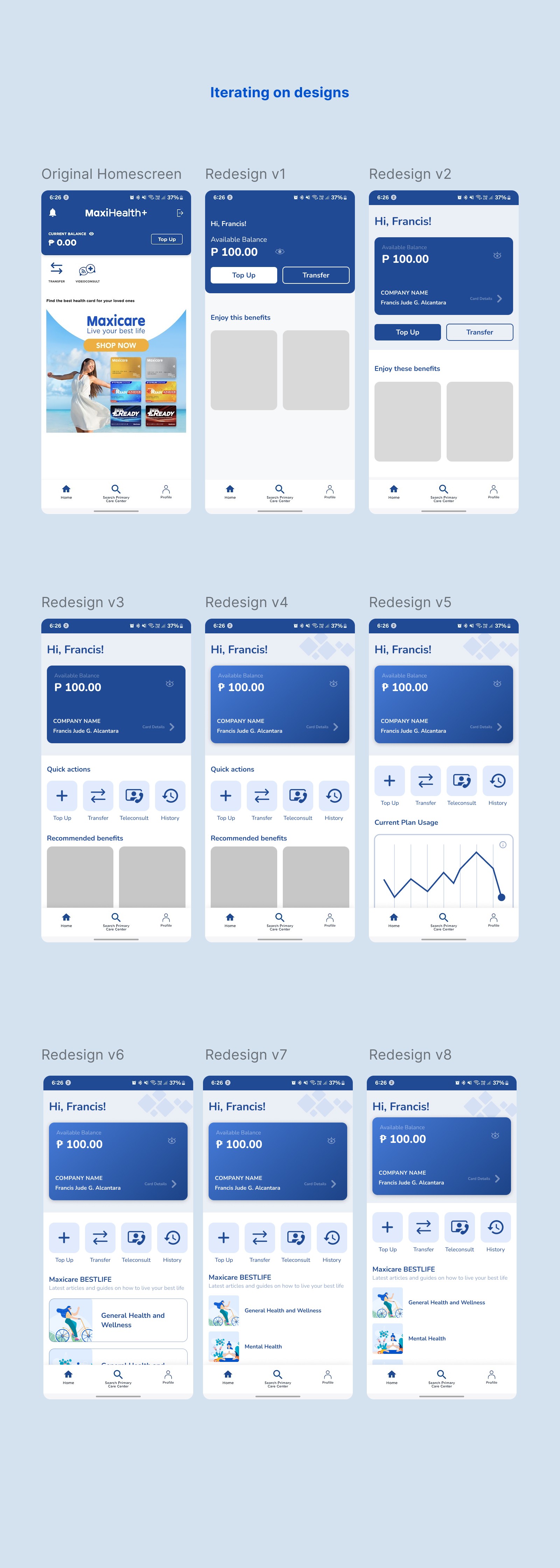
I tried out different ways to layout content
For starters, I placed the card right smack at the top so that when a user rushes to the hospital, they've got that card ready to go.
I also made the text much bigger---a whopping 20px for headers---to be more readable.
And I placed a few buttons for Quick Actions, following what the original homescreen had.
It felt empty below the Quick Actions and I could've left it as blank space but it seemed like a waste. The company has these blog articles that help people with various aspects of their health and well-being. I decided to include that there to promote the brand while also further providing educational value to the user.

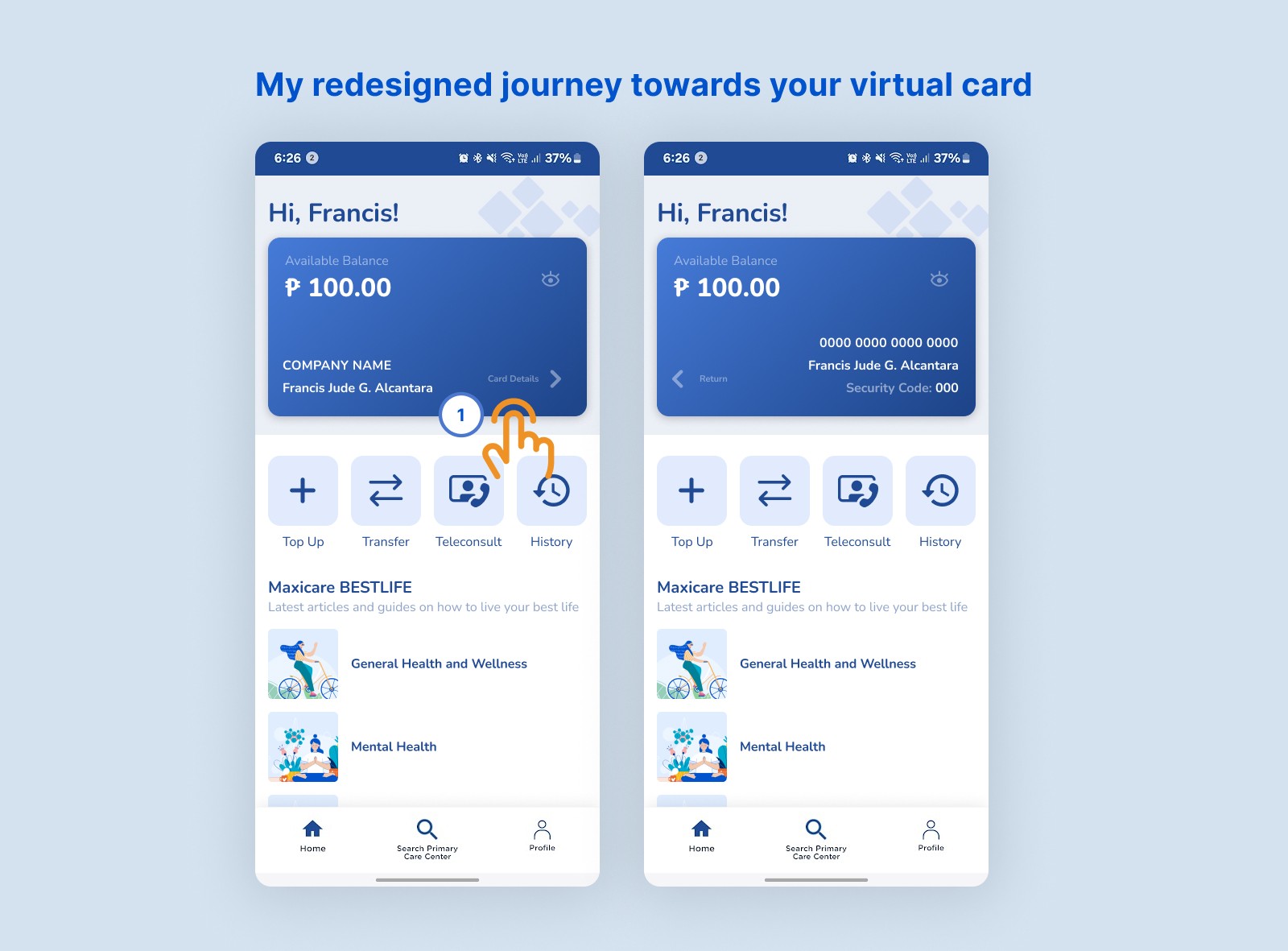
Why this redesign works
I believe this redesign is more effective because it puts the most important part of the app right in front of the users' face. Now, they won't have to scramble to find their card's details like how I did.