How a travel-like search feature improves a movie ticket site
Or: How a solo design sprint taught me the value of brainstorming and feedback
Timeline
1 week
Responsibilities
UX research
Brainstorming

The basics
Role: Research and UX/UI Designer
Timeline: October 30 - November 7, 2023
Tools: Figma / FigJam / Notion / Pen & paper
My process for doing the redesign was based on designer KayLi Wang’s solo design sprint.
Taylor Swift’s Era’s Tour Movie just hit Philippine theaters
It was going to be screened in Ayala Malls Cinemas. I was curious about booking tickets online, but something caught my attention:
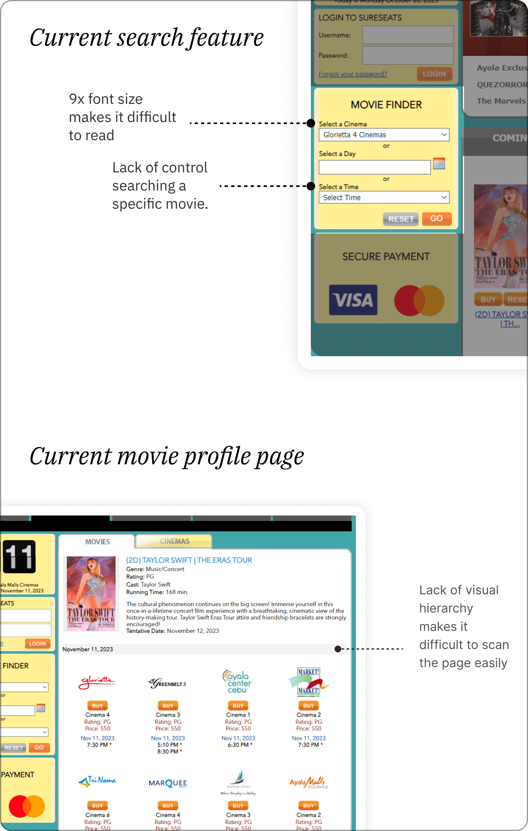
The booking site looked outdated
Sureseats is the de facto booking platform for Ayala Malls Cinemas. I’ve used it a couple of times to check on movie schedules, especially when I was younger; I remember decades ago visiting the site to check on movies my family and I could watch together.
The problem is that the site still looks like how I imagined it.
That’s when I decided that I could run a design sprint on the site.
Admittedly, this took longer than I intended because my full-time job and part-time gig were consuming the majority of my time. But I really tried to squeeze this one out and I’m glad with how it turned out.
What problem was I trying to solve?
How could I make Search more intuitive on the site?
Of course, there was a whole heap of design opportunities I could’ve tackled, but this seemed the most frustrating.
There isn’t a straightforward Search feature that you and I are used it. It’s primarily about toggles.
But the confusion doesn’t end there. The results the site shows feels cluttered in a way, taking up too much vertical space.
Before diving headfirst into the solution space, I wanted to understand as much as I could about how people use the site currently.
Day 1: Understand
What did I (and didn’t I) know about users at the moment?
I reached out to some of my friends who used the site—we’ll call them Cal and Jade—and asked them about their most recent Sureseats experience.
With a few pages from the Mom Test by Rob Fitzpatrick fresh in my mind, I decided to prod a little further, careful not to make many judgment-sounding comments like "That's cool" or "That sucks."
Here were the insights and observations I gathered:

Their answers made me curious about how other sites cinema or movie booking sites help users find movies to watch and schedules of when to watch them.
I looked at how other malls did it (Competitive research)
These were the websites I analyzed.
Cinema 76
Click the City
The Era’s Tour official website
Fisher Mall Cinemas
Power Plant Cinema
Robinson’s Movie World
SM Cinemas
SM Supermalls
SM IMAX
Vista Cinemas
The biggest insight I gathered was that other websites didn’t have a text input search function either. So it seemed like I had an opportunity here to really do something different and establish a design pattern.
There were 3 sites that caught my attention
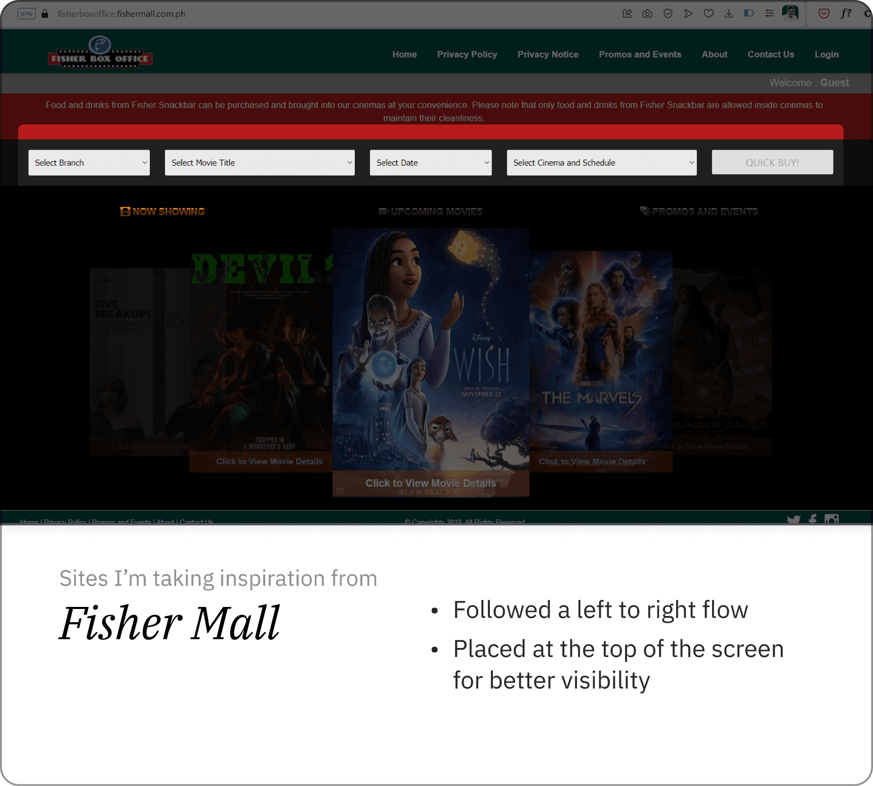
1. Fisher Mall
I liked how Fisher Mall’s search function is at the top of the homepage, drawing attention easily. It also seemed to follow a logical flow from left to right.
2. SM Cinema
They gave visitors the power to choose their starting point, whether it’s choosing a movie, location, cinema, or time.

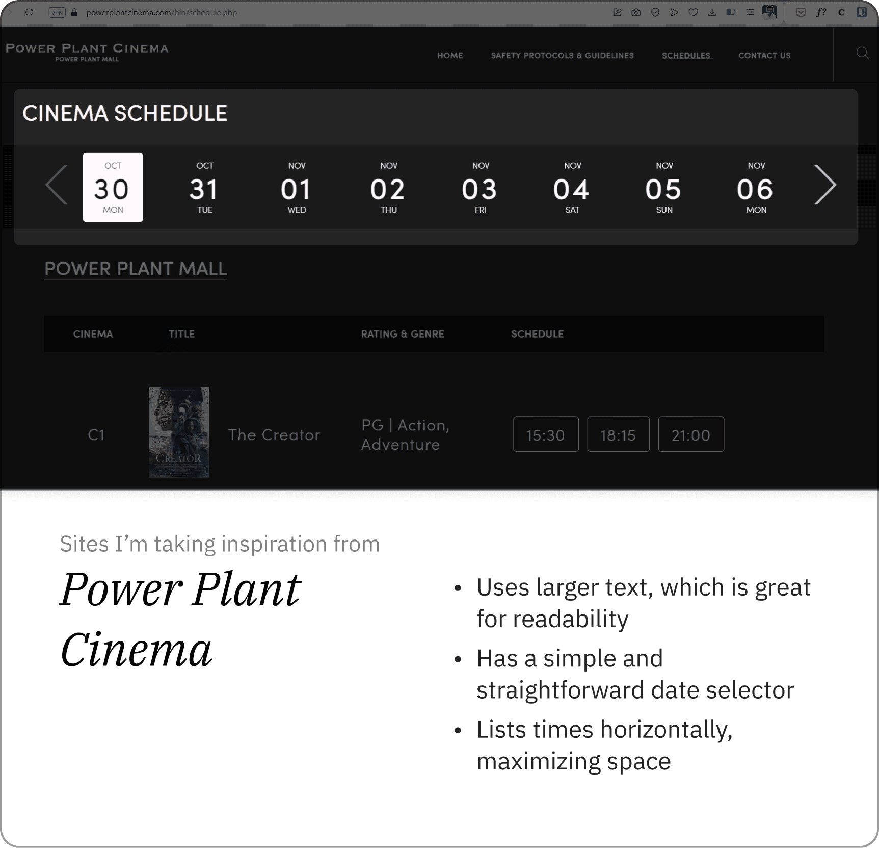
3. Power Plant Cinema
Thanks to its larger text, Power Plant Cinema easily had the most readable and straightforward site. Listing the time slots horizontally also seemed like an efficient use of space.
I took note of their design patterns because it gave me an idea of how I could lay out information on the site better.
Day 2: Understand / Sketch
I could only find an hour of free time to work on this rather than the usual 8 hours because my full-time and part-time work were busy, but I got to do two important things.
1. User Persona: Lisa
I created Lisa the user persona quickly to help me understand the flow of the actions my ideal user takes. Lisa is someone who already has the movie she wants to watch in mind, so now she’s just looking to see when and where it’ll show.
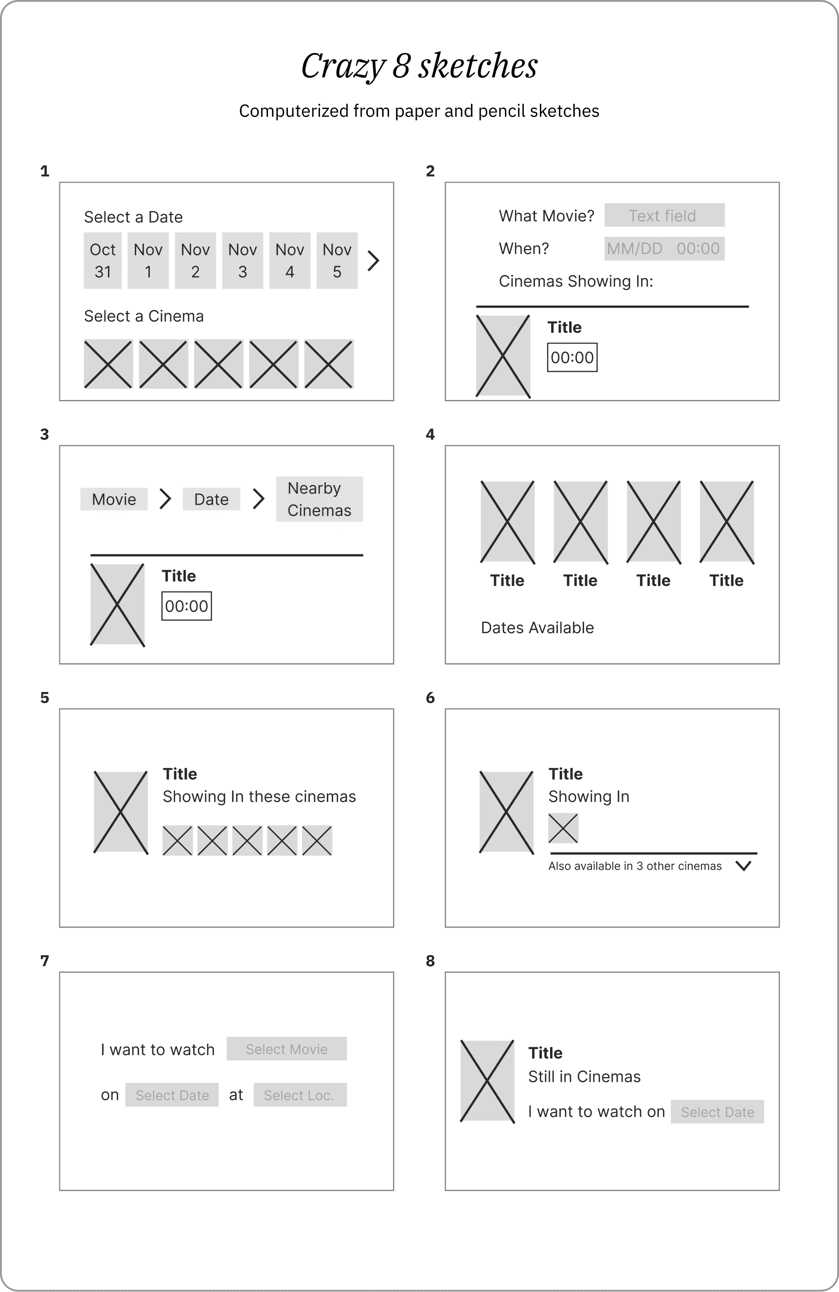
2. Crazy 8s Sketches
I had an idea of what I wanted but I didn’t want to get too attached to it. The Crazy 8s design sprint exercise seemed like a perfect way for me to start stretching my ideas.
8 sketches in 8 minutes. Admittedly, I wasn’t sure where I was going with some of them, but I suppose that’s the point of the exercise.
Here are the original sketches with the associated wireframes to clarify the ideas.
Day 3-4: Design
My aim for this design stage was to build at least something just to help get a conversation with users started, just like what Michael Seibel mentioned in Building an MVP.
Since I wasn’t sure how to design the UI and UX of an effective search function, I watched YouTube videos for research. My redesign would have to follow this information architecture:

Testing the prototype
Later in the day, I was able to test this prototype with my friends Cal and Jade. That meant asking them to find their way to the page that showed the schedules and cinemas showing the Era’s Tour movie.
That was an insightful experience since a lot of the assumptions I held onto while designing were proven wrong.
For example, I thought the cinema itself didn't matter; I thought people would just want to know where to watch. But as it turned out, it mattered because different cinemas have different pricing. The users I interviewed wanted to know which cinemas weren't speciality (e.g. 3D, Dolby Atmos, IMAX) so they know which expensive option to avoid.
Day 4-5: Design / Prototype
I redesigned my prototype with Cal and Jade’s comments in mind. There was one comment from Jade in particular that stood out to me. She mentioned that Sureseats was a booking site, and that I should look at how Cebu Pacific does it. I hadn’t thought of it like that before.
For my redesigns, I reviewed how Cebu Pacific and Airbnb do their search and booking function.

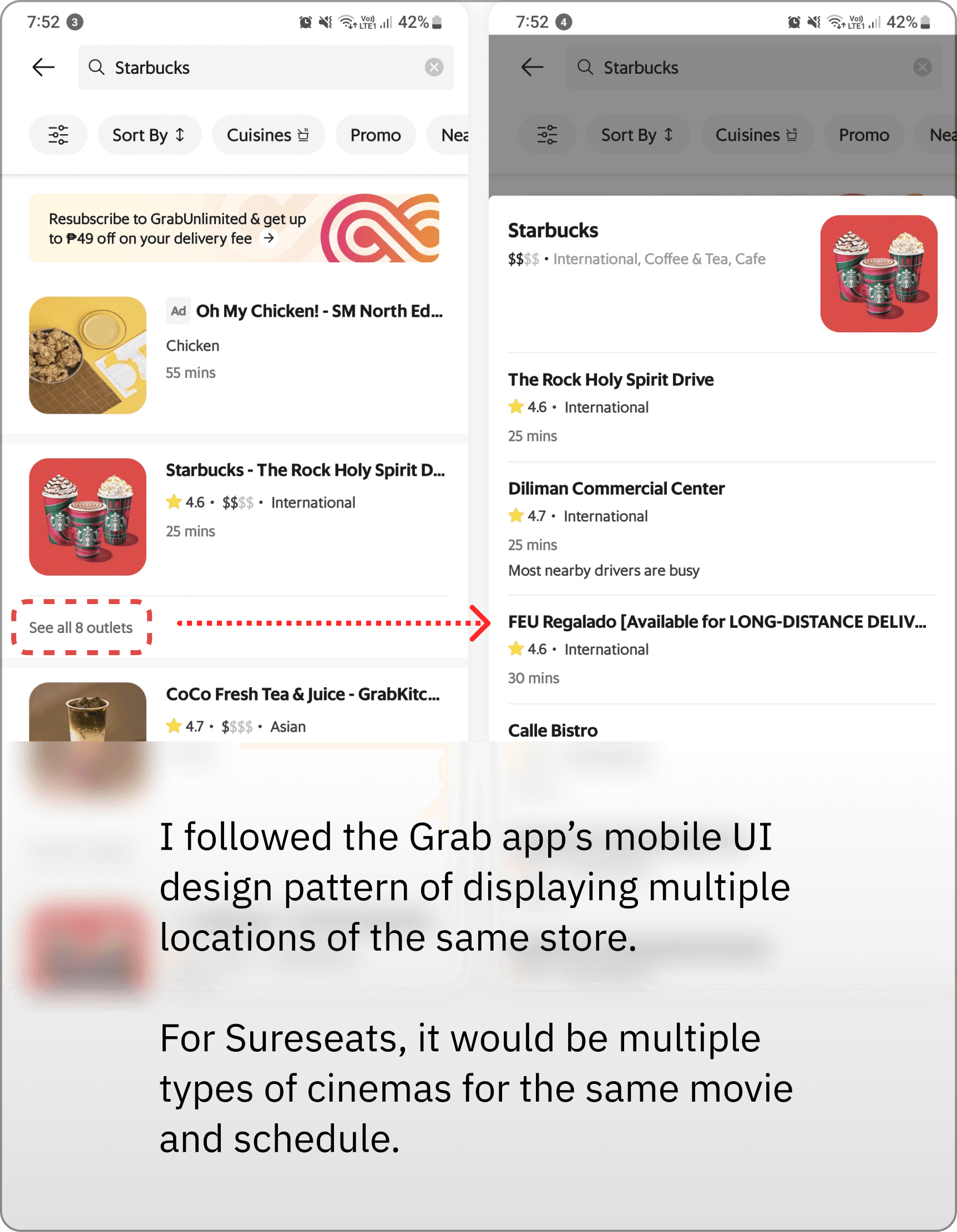
I also figured that Sureseats and GrabFood are alike in the sense that users can find their "products" in different venues; for GrabFood, it's meals and restaurants, while for Sureseats it's movies and cinemas.
That's why I redesigned the schedule results to include options for additional screening schedules, but for speciality cinemas (e.g. 3DX or Dolby Atmos screenings)
Breaking Down My Design
Designing a more straightforward process
Sureseats’ Movie Finder feature already had the essential components, allowing visitors to search depending on their preferences. My redesign mainly involved making it much clearer to visitors, as well as giving them the option to search for a specific movie.

Travel-like search
I realized that the design patterns for booking websites lent themselves well for something like Sureseats. Relying on Jakob’s Law, I created a similar Search function to reduce the cognitive load on site visitors. This allows users to quickly search the movie title, date, and cinema in one go.
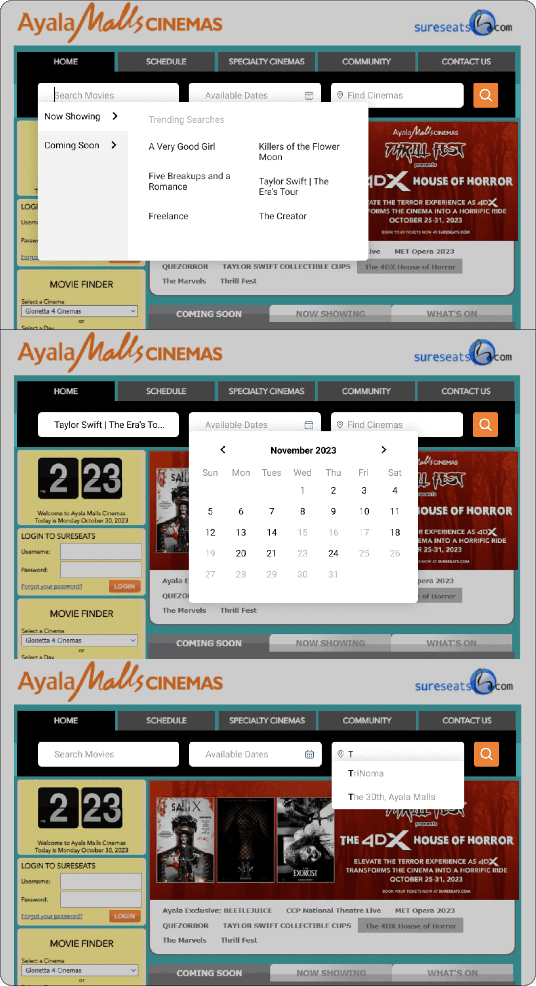
Specialty-Cinema Schedules
My original design lacked designations for which cinema certain schedules referred to. In version 2, I made the standard, 2D screenings of movies the default schedule. If visitors wanted to see the other types of cinemas---that is, the more expensive ones---they’d have to click to view more.
I took Grab’s design cue for this. This design is meant to prevent people from accidentally spending more on a screening than they intended/wanted.

What I Learned
Speaking with users is always insightful
Every time I spoke to Cal or Jade, I learned something new which I’d feel excited about tackling. Sometimes, designs felt like Schrödinger's cat, both good and bad until a user comes around with their insights.
Collaboration makes the process easier
After the first few sketches I made in the Crazy 8s, I didn’t know how else to design it. That’s when I realized how much easier the process would be with another designer to bounce ideas off of and redesign something together.