Improving the tone of Tonik's microcopy
So my background in content and copywriting came in handy after all
Timeline
1 week
Responsibilities
UX Copywriting

This post was originally posted on my LinkedIn
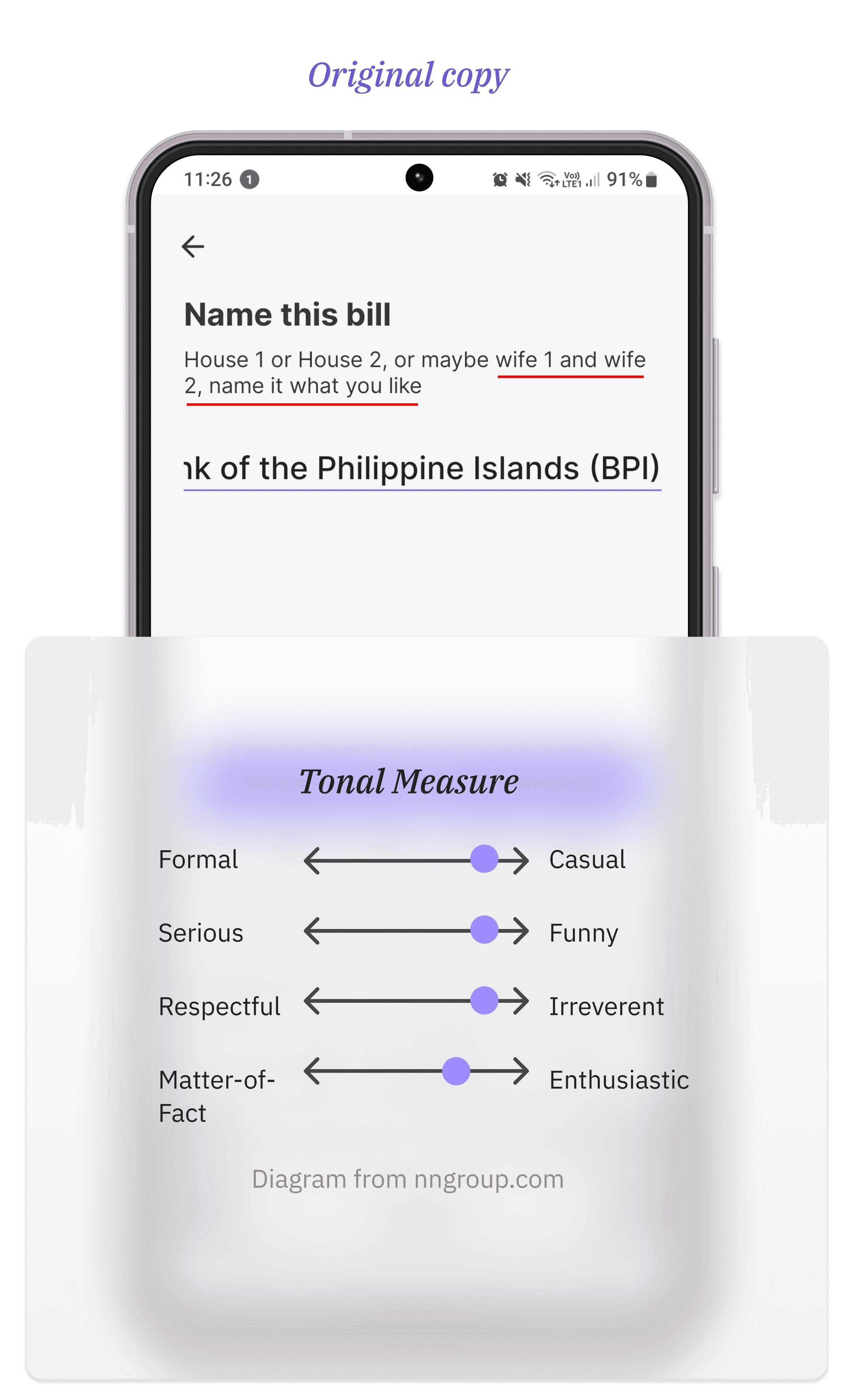
“Which wife do you want to pay today?”
That’s the vibe I got from seeing Tonik’s Add a Biller screen.
I stumbled upon this piece of UX microcopy while exploring the app. You can bet I did a double take when I read it. It assumes so much for such an innocent page. Surely, single people pay bills, too.
But to be fair:
Tonik isn’t known for its formality
They’re the only ones in my life who call me “luv” regularly (it’s how they greet me when they send my statement of account in my email). I get what they were going for. But there’s a problem.
Humor isn’t universal.
I asked some of my friends if I was crazy and they agreed it didn’t seem right.
The Nielsen Norman Group has this great piece on tone of voice.
Combining what I've learned about UX writing from that article and my background as a copywriter, I decided to play around with variations of the copy.
What if the UX microcopy was written in different tones?

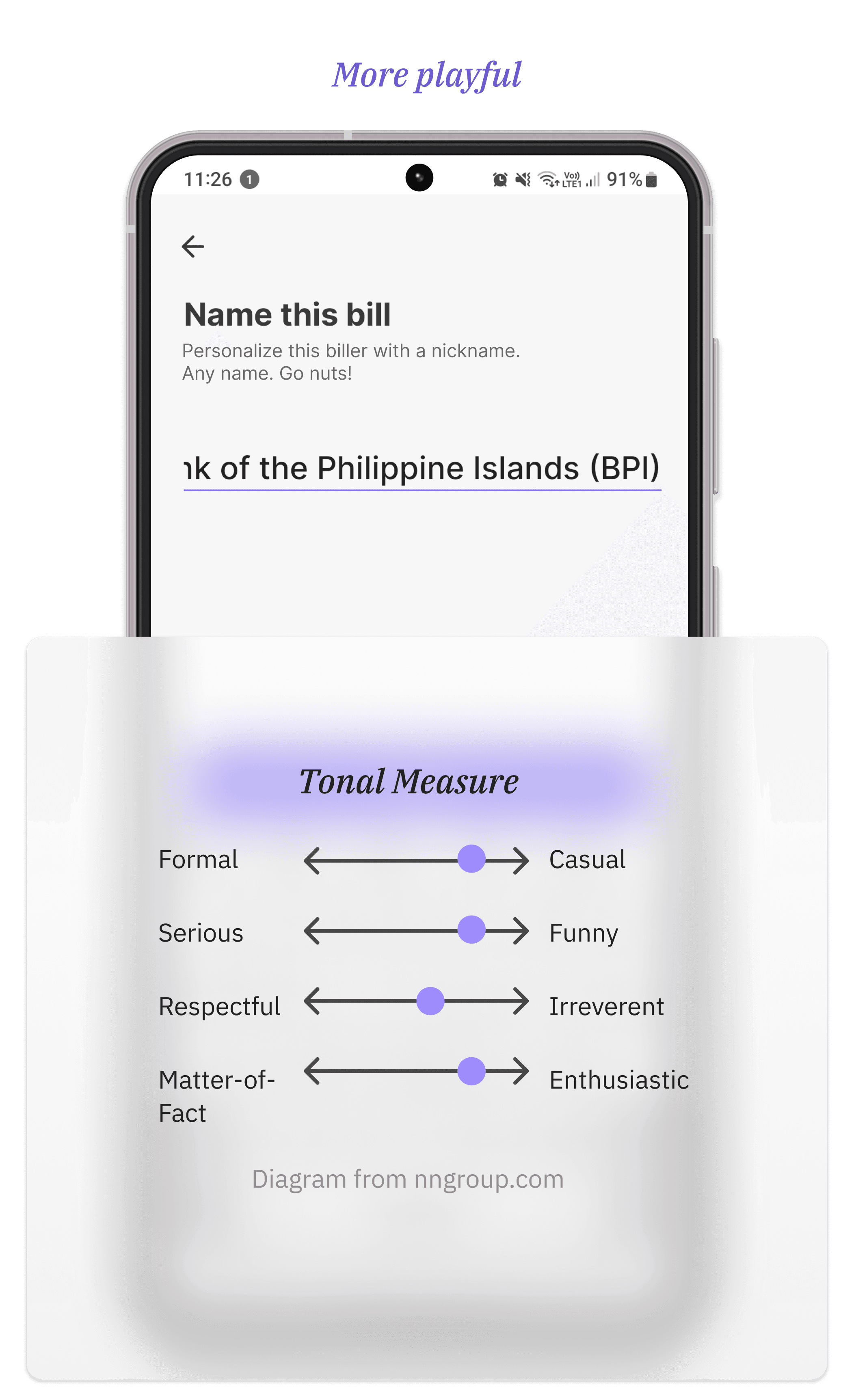
Could these be better? Am I overthinking this? Let me know.
Although it’s a small detail in the app, UX writing of any size plays a role in the product’s usability and branding.